Nowadays, your clients first impression of your spa is most often your website. Well-designed websites convey credibility and professionalism. If your website design is beautiful, organized, and easy to use your clients can trust that your services are on the same level.
Here are our favorite website designs from spas, beauty salons, and nail salons. Plus, insights into what makes them great.
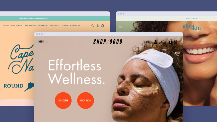
Shop Good is a clean beauty and wellness company that provides customized facials, waxing, and all-natural skincare. They promote holistic health in their online shop, blog, and at their physical spas & boutiques located in San Diego.
"85% of shoppers say product information and pictures are important to them when deciding which brand or retailer to buy from" (Google/Ipsos, 2019).
Their website is just as clean as their skincare. The use of large, easy to read headlines and two clear calls to action make it easy to shop their online store or book a service. A prominent, well organized menu makes the site simple to navigate while oversized imagery inspires wellness and self-care.
Scrolling through their shop, you'll notice the product images have consistent lighting with white backgrounds that maintain consistency across pages. Detailed product descriptions provide instructions for use, ingredients, and reviews. Not only that, but their blog features useful beauty and skincare content that spotlights the products they offer.
Wanna know what else makes Shop Good amazing? Read more here.
Leo is a nail salon that defines itself as "a space designed to create an environment that helps you find balance, prioritize and understand the importance of self-care." The soothing colors, well-curated, photography, and purposeful simplicity of this design fully aligns with that sentiment.
84.6% of web designers cite crowded web design as the most common mistake made by small businesses (GoodFirms, 2019).
This design uses empty "white space" to its advantage to give off an airy and uncluttered feel. The use of varying image sizes and shapes adds whimsy and interest without distracting from the main call to action. A clear "Book Now" button is immediately visible in the upper right hand corner, allowing clients to quickly book an appointment.
Located in the heart of West Hollywood in Los Angeles, Wax Melrose is a body waxing and niche beauty treatment salon. If it isn't abundantly clear from their website, Wax is cool. With a focus on self care, Wax embraces all people and welcomes everyone to their website with beautiful and powerful images.
"In the first quarter of 2021, mobile devices generated 54.8% of global website traffic" (Statista, 2021).
In keeping with the times, Wax's site is totally mobile-friendly. With a growing half of website traffic coming from mobile devices, having a site that's dually designed for small screens is extremely important. Wax executes this perfectly with a mobile layout that is just as premium and aesthetically pleasing as the experience offered on larger screens.
Glasskin is an "active skincare studio specializing in skin workouts, high-tech facials, and clean ingredients." They sell a range of skincare products to keep your self-care routine on point.
"In 2021, 53.9% of all retail e-commerce is expected to be generated via mobile devices" (Statista, 2021).
Glasskin's investment in professional photography really makes their website shine. Clear navigation and a top notch mobile experience makes it easy to shop skincare and book a facial all from your phone. Glasskin keeps things fresh with a site built for the modern shopper and takes advantage of website traffic coming from a range of devices and screen sizes.
Cape Cod Nail Co's website takes you to the beach. The lively pastel and nautical vibes really have you ready to get a pedicure and dip those toes in the sand. Visit this website to pretend like it's summer all year round—or shop their nail polish line and book an appointment.
It's not all about how the website looks. How well a website actually works, in a technical sense, is just as important. Cape Cod Nail Co.'s website uses a Shopify integration that syncs seamlessly with their spa software for seamless inventory management across their online and brick and mortar shops.
"In 2020, Shopify merchants generated more than $307 billion in global economic impact" (Shopify, 2021).
Shopify makes it easy to sell and ship products which is why it is the top platform for running an online store. Cape Cod Nail Co manages a nail salon, a physical shop, and an online store. With all that going on, they really do make it look like a breeze.
GBY "offers a sexy range of services" from lashes to tooth gems to facials and more. The use of stunning up-close imagery proves how good they are at what they do.
40% of consumers appreciate photography and images on a company’s website (Top Design Firms, 2021).
The purpose of a website is to engage visitors and captivating visuals do just that. This website gives you exactly the information new and existing clients need to know in a clean, inspiring, and organized manner. GBY Beauty simply gets it right with photos that make a statement, a clean and clear menu bar, and visible 'Book Now' and 'Shop' links.
Cheeks & Co. is "a space for you." As a spa specializing in facials and body waxing, their website brings you a moment of zen. Cheeks & Co lets you take a step inside their lobby and delivers on their promise to let you relax and unwind.
"When looking at a website for the first time, 38% of consumers look at a page’s layout or navigational links" (Top Design Firms, 2021).
No nonsense. Cheeks & Co keeps it simple with a large, impossible to miss navigation bar. The 'Book Now' button is prioritized with its placement as the first menu item. The colors, fonts, and product photography keeps this website looking clean and consistent from page to page.
Spa Tips You’ll Wish You Knew Sooner
Craving 100 quick, actionable tips to grow your spa? Marketing 100 delivers 100 bite-sized videos straight to your inbox, one day at a time.
Integrated Online Booking with Mangomint
All of the inspiring businesses discussed above, know the importance of providing a great experience for their clients online. That's why they chose Mangomint for their spa software and integrated online booking. Keep your
site beautiful with booking that embeds directly on your website, allows brand customization, and is extremely easy for your clients to use.
Mangomint's next-generation salon & spa software is designed to reduce costs and increase profits using smart automations and a beautiful client experience from booking to checkout.
To learn more about the software, please book a live demo or start a free trial today.
Try Mangomint for free
See Mangomint in action instantly with pre-populated sample data. No credit card required. Free for 21 days.
Josephine Hulburd Schultz is the Operations Manager of Growth Services at Mangomint. With a degree in Business Management and Entrepreneurship, she focuses on transparent and impactful marketing that empowers salon and spa owners to grow their businesses and succeed. Fun fact: Josephine is obsessed with testing out new curly hair products and trying out unique nail art.